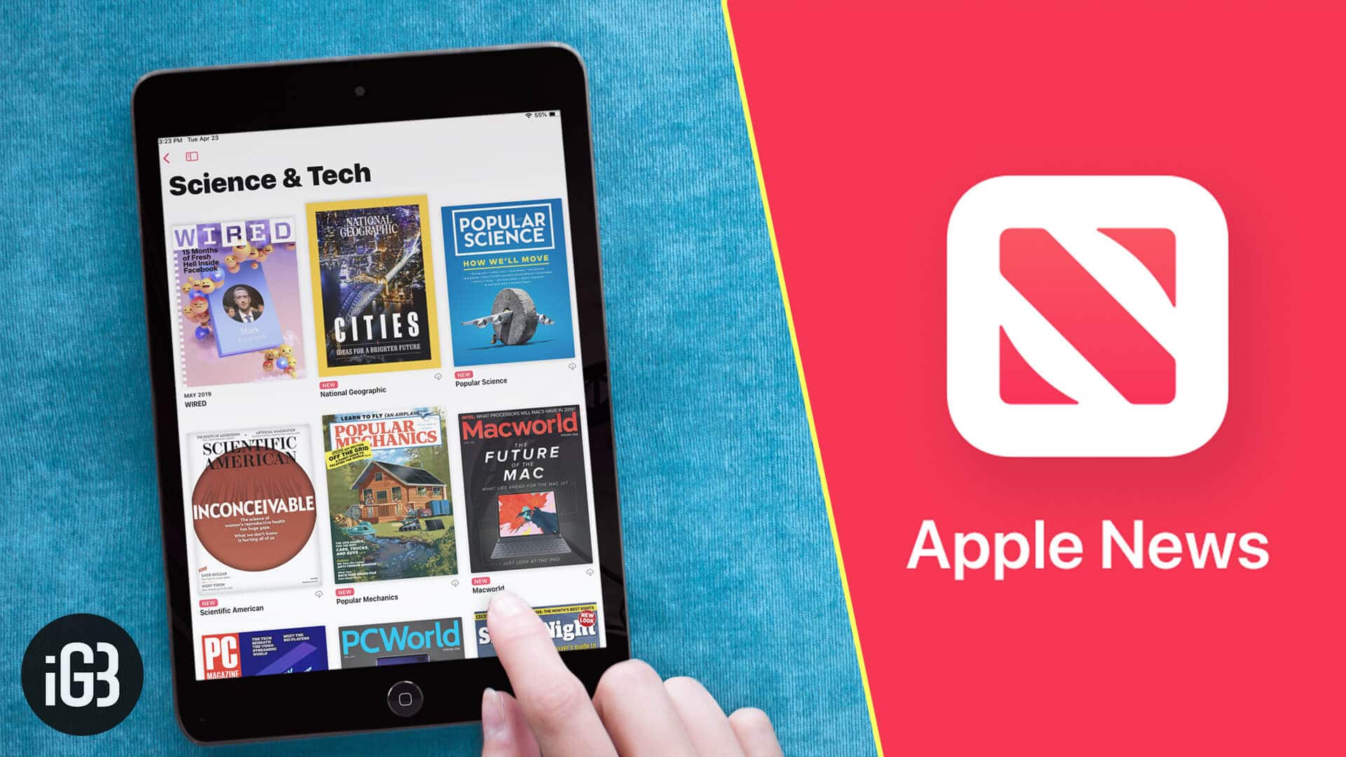
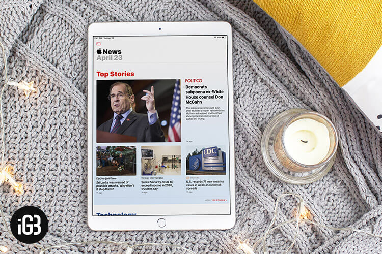
At times, it pays to be in a hurry to get things done on time. But when you are dealing with something as ambitious and significant as “Apple News Plus,” you’ve got to take control of your haste. Else, the outcome could be chaotic—to say the least!

After several months of speculation, when Apple’s news subscription service finally launched, I kind of rushed to give it a try as news and magazine reading has always appealed to my penchant. Being a tech writer, I found it worth keeping a tab on what the News+ has to offer. And it’s been almost a month since I started my long run with it.
From what I see, Apple News+ could be a huge asset for voracious readers and those who are fond of reading magazines. But without mincing my words, I’d say that the service seems to be badly executed.
Though News Plus does have the intent and the resources to appeal to people who love to read detailed and in-depth stories, it doesn’t yet appear to be ready for the mainstream. Speaking the truth, I can’t remember the last time I had to deal with such an entirely messed up app. Here is the detailed review of the news service:
Apple News Plus+: Too Buggy and Looks In Complete Mess
Wish The App Offered The Freedom to Choose Topics Upfront…
Unlike many popular news and magazine apps like Magzter Newsstand and Readly, the Apple News app doesn’t provide enough customization upfront. I would appreciate it if allowed me to fine-tune everything as per my interest during sign up itself.

For instance, it would be better if it offered the option to choose from several topics like technology, politics, health, sports. And based on what I’ve chosen, it would show me only the tailored stories. It would really simplify the experience.
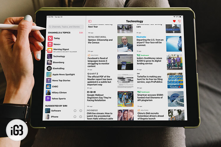
As far as I know, the app doesn’t offer a quick way to switch between different topics. Therefore, I find it inconvenient to browse through the articles of different genres that I like to explore.
Truth be told, this implementation shouldn’t have taken much effort and time. Given how significant it is, I wonder why Apple didn’t even think of giving it a look!
Too Buggy To Run Smoothly
Right from the moment I dived into the News app, a can of worms started to haunt me. I subscribed to the news service on my iPad, and when I wished to take a peek at the content on my iPhone, it stopped me from accessing the content.

Fortunately, I was able to somehow fix the issue by canceling the subscription and re-subscribing to it. But when I re-subscribed to the service, Apple deducted $9.99 (the monthly subscription fee) even before the completion of the free one-month trial.
I can’t remember when was the last time had I come across such a buggy app. What on earth Apple is making such blunders! If they can’t take control of such minor things, what’s the use of those trillion dollars?
Such flaws could easily have been fixed by a simple quality assurance team. I guess they have kind of thrown the news app for the public even without bothering whether it’s ready to deliver even basic performance. To even think that a company like Apple would ever do it is unacceptable.
By now, I felt completely drained out… Having been part of the Apple ecosystem for long and used almost everything that the company has offered, I however soon let go of the $9.99 and the buggy experience. And I got back to testing the news app again—with a bit of heavy heart.
Completely Disorganized Magazines
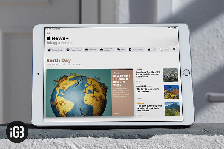
One of my biggest complaints about the app is that the magazines aren’t organized at all. While some of them look in sync, many of them appear to be incomplete disarray. Worse, their sizes don’t match at all.

To be more precise, many magazines’ interface doesn’t offer the option to change text size and even lacks the feature to love/dislike and add them to the Safari reading list. They seem to have just converted their articles into PDF and placed them randomly–even without taking user-interface into consideration.
To me, a neat interface is a must as it makes for a seamless reading and content viewing experience. The layout is pretty much like a normal blog article, which appears to be odd. Due to the lack of intuitiveness and the proper layout, the News+ doesn’t offer a true magazine reading experience.
Comparatively, I find Magzter’s interface more seamless. Everything from the navigation to the suggestions looks in perfect sync. The app allows me to make a nice collection of all the stuff I like reading. Moreover, it provides quick access to the things that I’ve recently viewed or would like to catch up with.
Magzter’s user-interface looks fully geared in line with the layout of a magazine. As a result, it appears to be more inviting, and your eyes feel comfortable going through the story. And that plays a vital role in enhancing the overall experience. I wish Apple’s offering was pretty much on the same line.
Lack Of Personal Touch
Another department where Apple needs to seriously work on is bringing some personal touch into the mix. I mean I would have really liked if there was a profile page from where I could easily track all the magazines and newspapers that I follow.

I want my favorite magazine app to pay special attention to my interest and offer suggestions accordingly. It not only makes it a lot easier to jump to the things that I like to catch up with but also boost the reading experience. News+ seems to have no idea what I’m up to or what sort of stories I enjoy reading. That’s probably the reason why its suggestions seem to be merely shooting in the dark.
The app adds all the magazines that I browse to the My Magazines section, even though I haven’t followed them. As a result, this section appears to be incomplete chaos.
It would be better if there were an option to take a look at all the “Recently Viewed” things. Besides, the inclusion of subsections like “The Topics You May Like to Explore” “Most Loved” “New Arrival” “Popular Topics” would really enhance the app.
Where Is The Option to Manually Delete Downloaded Magazines?
While exploring the news app, I downloaded some of my favorite magazines. And once I had a look at what they had to offer, I decided to clean up all the downloaded stuff. So, I started to look for ways to delete them all.
But even after spending plenty of time, I just couldn’t find the option to remove the downloaded magazines. It kind of completely turned me off, and I started wondering if at all Apple offered an option to manage magazines.
Just when my frustration could get the better of me, I stumbled upon an Apple support page where I was able to discover the truth. The company says that the issues of a magazine that a user follows are automatically downloaded and they are deleted after 30 days. If there is a lack of storage on the device, the automatically downloaded magazines are deleted even before the 30 days.
Apple says that a user can’t delete manually downloaded magazines, and they are removed only when there is less space on the device. Frankly speaking, I find this method of managing stuff bizarre and rather inconvenient.
All I want to have is complete control over my stuff and decide whether I should keep something or wipe it out. By not offering the desired manual control, Apple seems to have made the management of content both complex and mysterious.
Wish…Apple Were Not In A Hurry Anymore…
I don’t know why Apple seems to be so hasty for introducing things that aren’t yet ready. At best, the News Plus seems to be in beta 1 and would take some good time and serious thinking to become more stable, reliable, and user-friendly.
I know Apple will be able to eventually fix most of these issues. But I can’t base my judgment based on what’s gonna happen tomorrow. Who knows it might get even worse and the tech giant might be forced to completely scrap it–due to the horrific response.
They say, “Well begun is half done.” And if the beginning looks so messy; dreaming of a massive turnaround later seems to be nothing but wishful thinking–at least on the cards!
What do you think of Apple News Plus? Would you like to subscribe to it? Share your thoughts in the comments below.
