With the launch of the iPhone X in 2017, Apple introduced the infamous notch. Three iterations later, the notch is still part of the latest iPhone 11, iPhone 11 Pro, and iPhone 11 Pro Max. Despite all its functional value, the notch does hinder the consumer’s viewing experience.

So, it was expected that Apple would either reduce the size or remove the notch in its 2019 iPhone 11 series. However, that did not happen, and I wondered why Apple still hung-up on the notch? Especially when Apple’s competitors are bent on finding a viable solution for the screen-obscuring display notch before the pioneer.
In their respective attempts, Samsung, OnePlus, Huawei, and Oppo experiment with hole-punch style notches, pop-up lenses, or slide-out cameras. But where is the tech giant standing in this race, or is Apple even willing to be part of the said race? Let’s check out.
Why Is Apple Still Hung-Up on the iPhone Notch?
The Notch Story
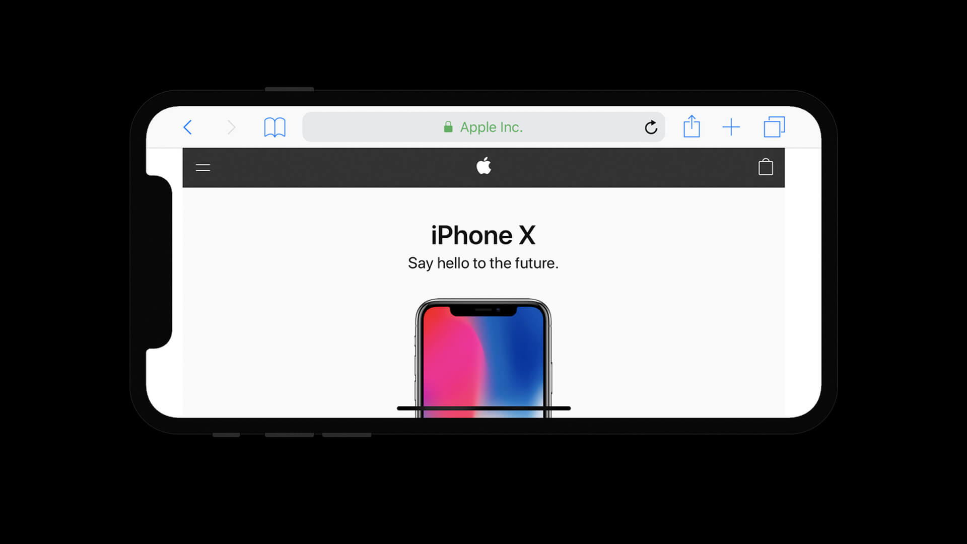
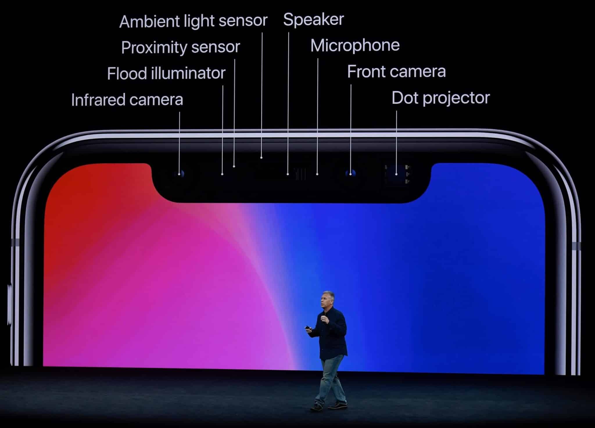
Apple implemented the Notch to accommodate a number of its features like the front camera, stereo speaker, microphone, flash, and many sensors for Face ID. These Features were earlier part of a thick bezel that typically covered a great deal of your screen.
The original iPhone had a screen-to-body ratio of 52%, and the 6S is at 64%. In simpler terms, the edges around your screen were becoming thinner with each iteration. The iPhone X and later models managed to achieve an 85% screen-to-body ratio. This improvement was possible due to two significant changes – removing the home button and a notch.
The Notch enables the designers to offer an edge to edge screen while maintaining all the features. However, as is with almost all Apple features, this change was met with sharp criticism.
what is a iphone notch?
Upon its launch, the little black strip had to face much ridicule and memes. Though, as always, the competitor went ahead to adopt the innovation. Throughout 2017 and 2018, Apple competitors launched a hoard of smartphones with variant versions of the ‘notch.’
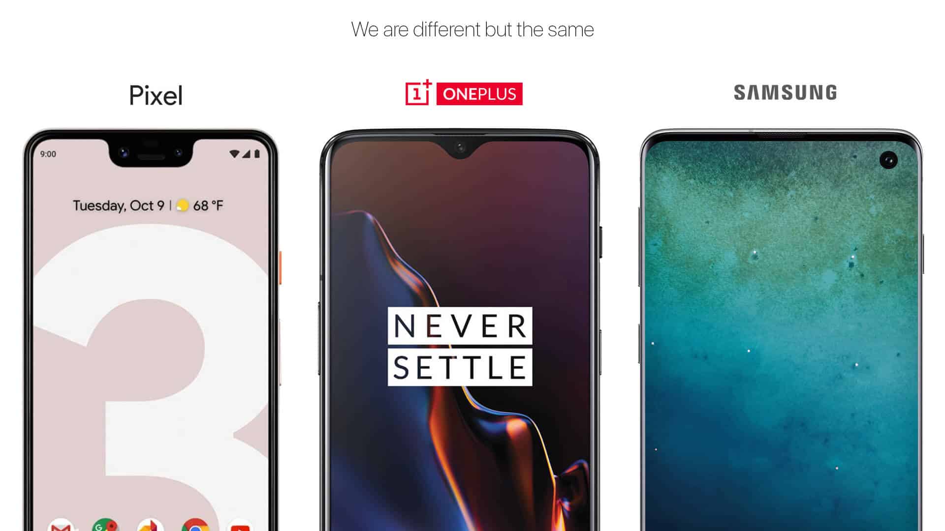
The Huawei Mate 20 Pro came up with a shorter, more elongate notch that housed a wide array of sensors. OnePlus 6T went for a teardrop-shaped notch, and Google Pixel 3 incorporated a large, curved box for a notch.

Samsung did resist for a while but ultimately reduced the bezel in its 2019. flagship, the Galaxy S10, in favor of an Infinity-O display. It incorporated a ‘hole-punch’ notch for the front camera, which also houses the facial recognition sensors. Stereo speakers are placed on the top edge of the device. We even have several examples where Samsung has eventually followed suit to Apple’s inventions.
All smartphones featured a notch, either by resizing it, changing the shape or by merely renaming it.
Cut that Notch
As per most designers and tech enthusiasts, the notch is a temporary stop before a no intrusion screen is developed. Many smartphone manufacturers have been introducing techniques to circumvent the notch.
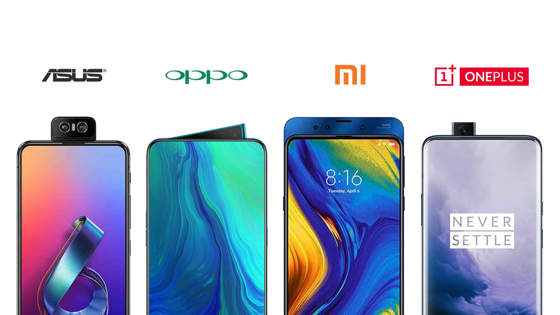
A few flagship developers have come up with some innovative plans, from pop-up cameras to motorized cameras. For instance, the OnePlus 7 Pro’s front-facing camera pops up from the back of the phone. Oppo Find X and the Vivo Nex hid the front camera via an electrical mechanism, and when you activate the camera for a selfie, it will pop-up.

Even Asus ZenFone 6 incorporated a camera that flips up from the back. As for Xiaomi Mi Mix 3, it used a sliding mechanism. Chinese smartphone manufacturer Nubia X employs another nifty hack. The phone has a second screen to use the front-camera features, such as a selfie from the rear camera itself.
So, if every other smartphone is getting a notch-free display, then why not iPhones?
Why Apple not removed the Notch from iPhone?
In theory, these ideas seem to be brilliant, but they are not similar to a child’s school project in terms of practicality. The developers have gone to extreme lengths to exterminate a simple notch, but in turn, developed mechanisms that are somewhat fragile and flawed.

For instance, doesn’t the pop-out makes the phone vulnerable to dust, debris, and water. Would you be able to take a selfie with these phones under-water? Or what if the phone slips from your hand when the camera is popped? Then the motorized ones!! Isn’t there a risk of a break down with frequent use in just a few months? Further, no matter how speedy the mechanism is, it can’t be as fast as your trusted front camera.
Why Hasn’t Apple reduced the size of the Notch?
While opting for an external mechanism is out of the question because of apparent reason; why hasn’t the tech giant tried to reduce the notch’s size in the iPhone 11 series. In all honesty, everyone has managed to reduce to a teardrop shape.
Other industry leaders have been reserving the hefty notch design to their mid-range or low-range phones, for instance, the Xiaomi Mi 9 or the Moto G7. So why Apple? Why? Well, I tried to find a reason behind it and unsurprisingly found a few pointers in favor of the black strip.
Unmatched Features
Most of these other smartphones do not carry the array of features that an iPhone does. Let’s take the facial recognition, for example; while almost everyone has joined the race, not many android devices managed to come close to the precision of Apple.

iPhone’s Face ID hardware consists of a three-module sensor – a dot projector, a flood illuminator, and an infrared camera. Apart from these sensors, the notch has a great selfie camera, speaker, microphone, and some other sensors that are responsible for a wonderful user-experience. So, as per me until Apple finds a perfect solution to hide them uncompromisingly; it will stick with the notch.
It’s Already a perfect design
Look closer to the above picture for one plus’ tear-drop design and Samsung’s punch-hole display, they have speakers on the top bezel. Basically, to reduce the size of the notch, they have separated certain features and integrated certain features together.
However, the small notch is equivalently disturbing as a big one; then why not keep everything together. Further, we should appreciate Apple’s vision of positioning the notch out of the direct line of sight. Upon its launch, many people called out the tech-company for interrupting their view.
But as they started using the device, most understood that the notch does not interfere with their viewing experience. Additionally, Apple is in charge of both its software and hardware; so a change in anyone can be well accommodated by the other.
As for Apps, the developers already develops a separate iOS app, and they only had to make a few updates to seamlessly accommodate the notch. In direct contrast, the manufacturers of Android smartphones do not have such liberty. Whether they keep the notch big, small, centralized or sidelined, the operating system and subsequent apps follow a universal code. Which might or might not be suited for their ‘notch style.’
Patented Technology
Smartphone manufacturers are using several patented technologies to find an ideal solution. Apple has quite a few patents in the field, from hiding the camera behind the display to display based speakers. In fact, the tech giant has also patented a screen design with holes invisible to naked eyes that will hide sensors, speakers, and cameras.
However, perfecting these techniques will take a while, and unlike its competitors, Apple doesn’t introduce features at a nascent stage. This is important because every device needs to be near – perfect. For instance, to save the ear speaker holes, Xiaomi’s 2016 Mi Mix housed the speakers within the phone.
While a great idea, this caused the phone to vibrate a lost and raised privacy concerns. Do you think Apple would launch a model with such a major flaw?
Limited Model Iterations
It is also to be noted that Apple does not release more than 3 devices in a year. While competitors like Samsung, Oppo, Xiaomi launches multiple devices over the year. This gives them the liberty to experiment (such as above) and develop a device that users might not enjoy.
Such experimental phones have a small shelf life, and Apple does not support that ideology.
It’s iconic
As a brand, Apple has always introduced an iconic design that has been instantly recognizable even after ages; remember the iconic first iMac design. In the previous models, the Home button made the said impact.
And iPhone X onwards, the responsibility is on the notch’s shoulder. The idea is that consumers could instantly recognize Apple products, whether they use it or not. As and when Apple shifts away from the notch, it would be for another iconic design; making it small or in some other shape wouldn’t cut it.
To Notch or Not To Notch!!
In all honesty, the notch does not bother me at all. Not because I love all things Apple, but simply because it did not really affect my usage in any way. On the contrary, I got a bigger, better screen to play around with.
Looking at the company’s track record, I entrust that as when Apple finds a viable solution, it will kill the notch. But only and only when a better, smarter, and innovative solution is found.
I am keeping my figures crossed, are you?
What are your feelings about the notch?
Do you think it is disturbing your usage or viewing experience?
Share your views with us in the comment section below.
