With too many apps installed on your Apple Watch, locating and accessing the ones you use most can get a bit challenging. Fortunately, you can organize apps on your Apple Watch to make accessing your favorite apps much easier.
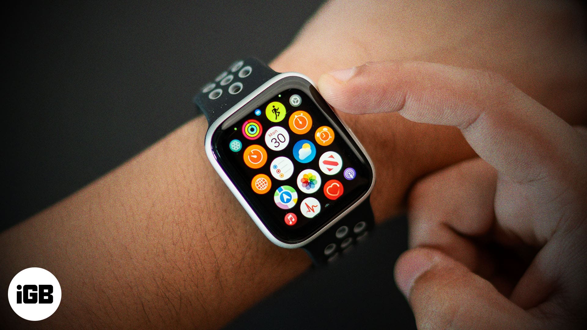
Keep reading, and we will show you how to organize apps on your Apple Watch.
Why should you organize apps on your Apple Watch?
Organizing apps on your Apple Watch isn’t just about aesthetics; it’s also about enhancing your productivity, functionality, and overall user experience, as with an organized app view, you won’t need to scroll across a multitude of apps to locate the one you need.
Here’s how organizing apps on your Apple Watch can help in the long run:
No matter how advanced your Apple Watch is, interacting with its small screen will always be quite tricky. As such, when you have all apps scattered randomly in Grid View, locating the one you need takes a bit of work. However, once you have organized the apps, you will be able to locate and access your most-used apps quickly and easily.
2. Increased productivity
Imagine you need to check your calendar, track your workout, or monitor your heart rate in one go. In this case, an organized app view ensures you can access them more quickly; you can list apps alphabetically or group more important apps together.
3. Customization to fit your needs
Organizing apps allows you to customize your Apple Watch user experience to suit your lifestyle and preferences. For instance, if you are a fitness enthusiast, you can place all the fitness-related apps at the top of others so you can access them easily.
4. Less clutter
Keeping your Apple Watch storage and screen cluttered with unnecessary apps does no good. Removing unnecessary apps not only helps you declutter the screen and free up space on your Apple Watch but also ensures that you don’t need to navigate across them first to reach the one you need.
Different ways to view apps on an Apple Watch
Apple offers two app view options on the Apple Watch: List View and Grid View.
Grid View
Grid View is the default App View of the Apple Watch, in which all the installed apps appear in a honeycomb layout. You can navigate the Grid View by scrolling with your finger or using the Digital Crown to zoom in or out.
Pros
Cons
List View
In List View, the apps on your Apple Watch are displayed in a vertical list layout and are sorted alphabetically. You can use your finger or the Digital Crown to scroll up and down on the app list.
Pros
Become an iGeeksBlog Premium member and access our content ad-free with additional perks.
Cons
You can decide which app view to use on your Apple Watch by weighing the pros and cons.
How to switch between Grid View and List View on your Apple Watch
The first step to organizing apps on your Apple Watch is to decide whether you prefer the default Grid View or the List View. While List View sorts the apps alphabetically, Grid View allows you to rearrange the app grid.
You can switch between both app views on your Apple Watch in two ways:
Directly on the Apple Watch
- Press the Digital Crown on your Apple Watch to access the App View.
- Here, scroll down to the bottom and tap the List View button.
- Once done, your Apple Watch will switch from Grid View to List View.
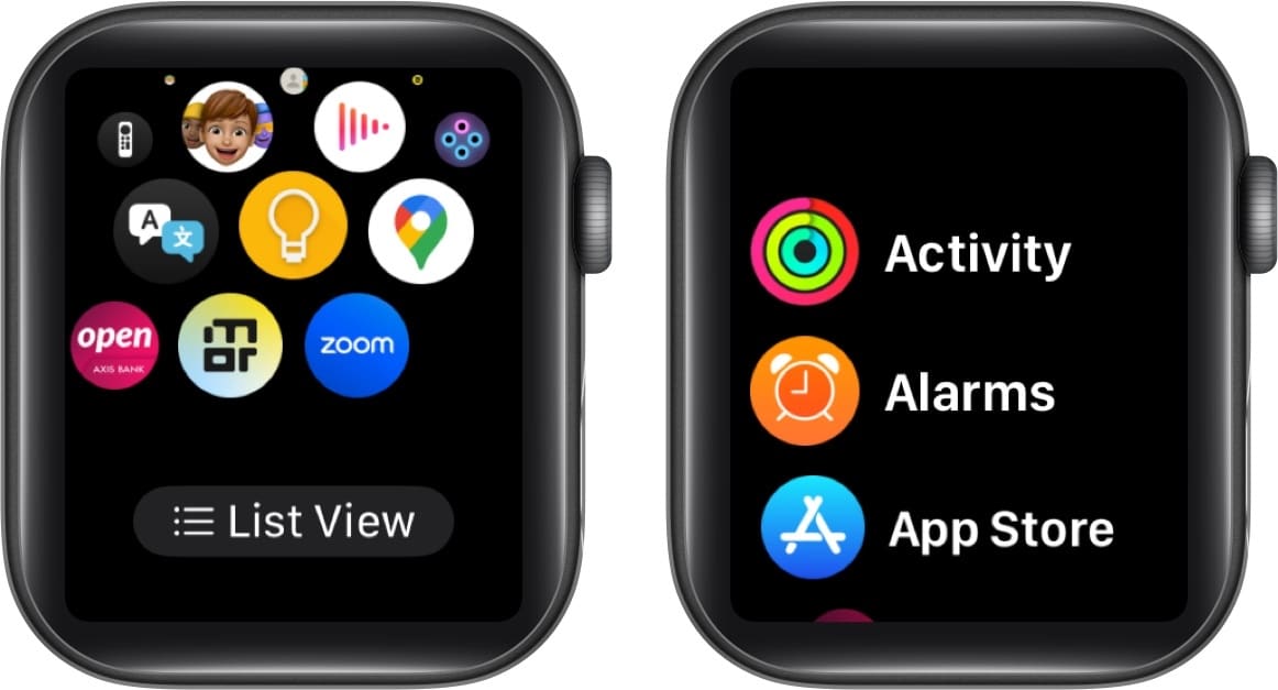
- Repeat the process if you want to switch back to Grid View.
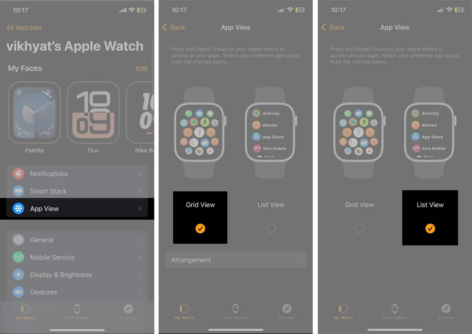
Using the Watch app on your iPhone
- Open the Watch app on your iPhone.
- From the My Watch tab, tap on App View.
- Next, tap on List View to switch from the default Grid View on the Apple Watch.
How to rearrange apps on your Apple Watch
While you can choose between the List View and Grid View on your Apple Watch, only the Grid View allows you to rearrange apps according to your preference. The List View, on the other hand, has a fixed layout, with all the apps arranged in alphabetical order.
You can rearrange the apps in Grid View in two ways:
Via the Apple Watch
- Press the Digital Crown to access the app menu.
- Tap and hold the desired app, then drag and drop the app to the preferred position.
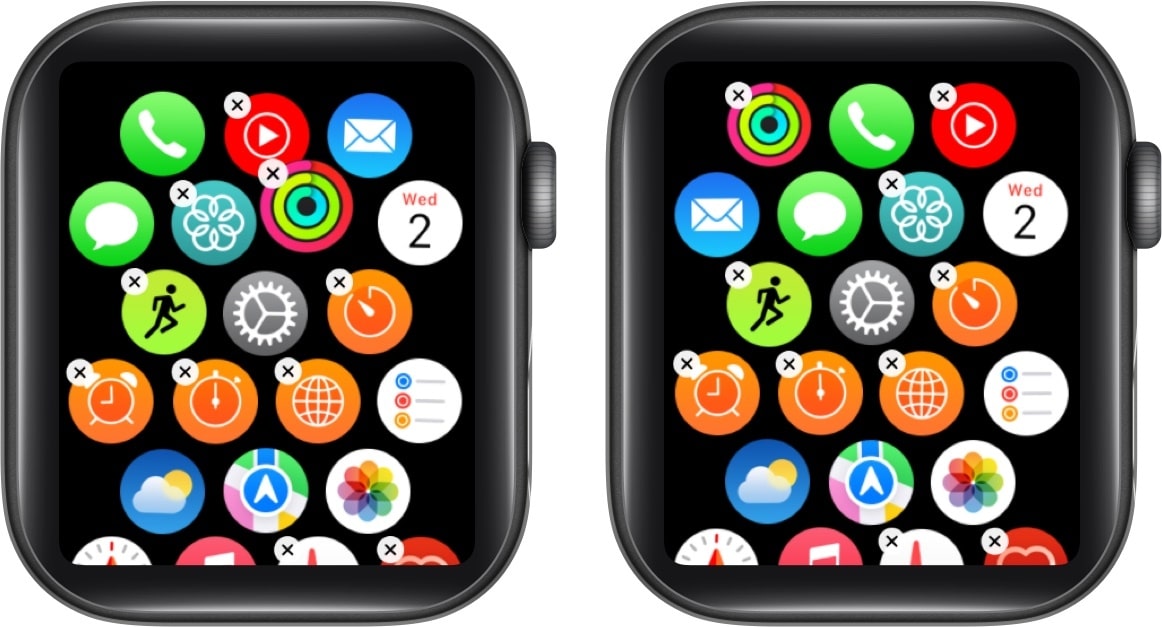
- Repeat the process to drag and drop the app anywhere in the Grid View.
Via the Watch app on your iPhone
- Open the Watch app and tap App View.
- Select Grid View, then tap on Arrangement.
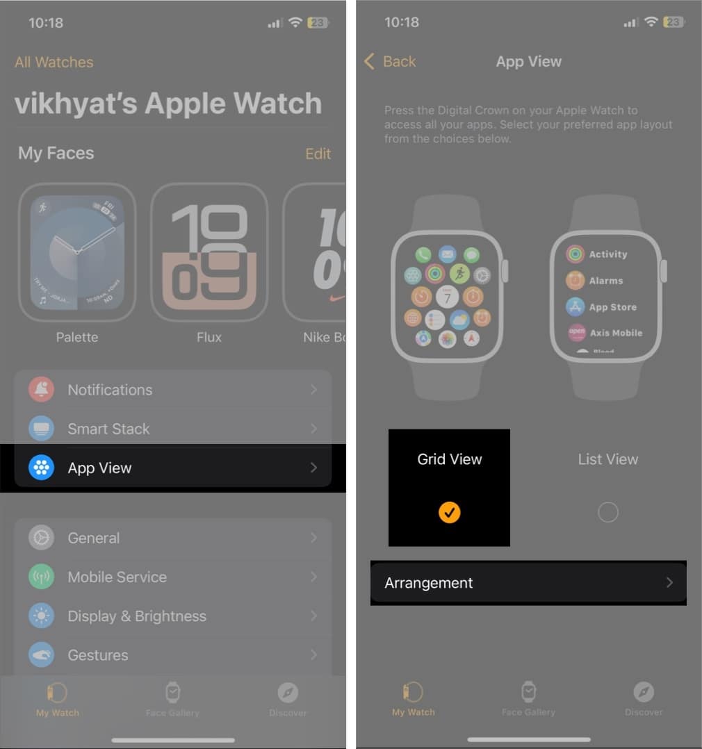
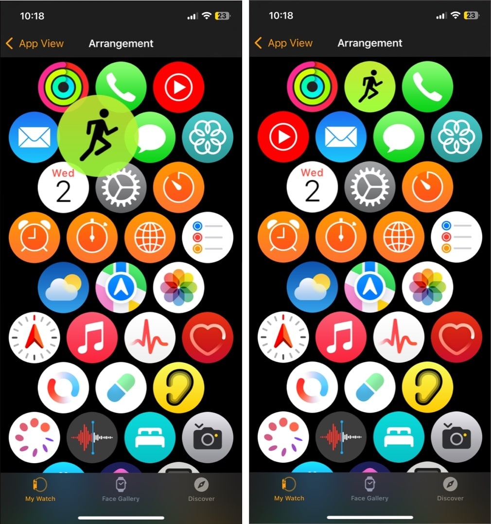
- Next, tap and hold any app and drag it to your preferred position.
- Repeat the above step for the number of apps you want.
Get to your favorite apps faster...
Those are all the ways you can organize apps on your Apple Watch. Whether you prefer the visual appeal of the Grid View or easy navigation in the List View, organizing apps on your Apple Watch will improve your user experience, as you can focus on the apps more important to you.
Feel free to reach out to us via comments if you have any doubts.
FAQs
Yes, you can. All you need to do is head to the Watch app, scroll to the app, select it and toggle off Show on Apple Watch. The change will immediately reflect on your Apple Watch.
When you change the default App View to List View, all the apps on your Apple Watch are alphabetically sorted.
Also read:
How to use the Apple Watch Control Center
