Apple has introduced a groundbreaking feature known as Dynamic Island with its iPhone 15 series and the iPhone 14 Pro models. This innovative addition promises to revolutionize the way users interact with their devices, offering a dynamic and immersive user experience with iOS apps like never before.

In this article, we will explore Dynamic Island’s intricacies and provide a step-by-step guide on how to harness its capabilities to enhance your iPhone experience.
A new iconic front design: Dynamic Island

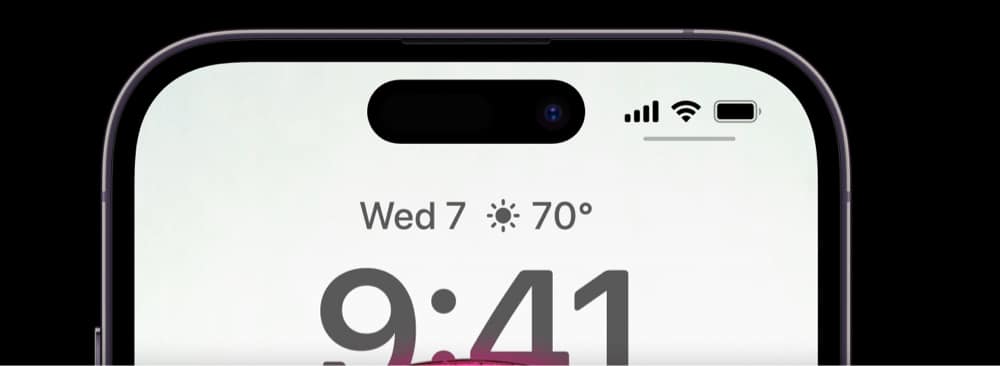
Apple has finally responded to the hatred of many Apple users over the iPhone’s notch. While the company didn’t really remove it, Apple redesigned the notch as a pill-shaped cutout that it likes to call Dynamic Island.
As the name implies, Dynamic Island is an “island” that sits at the top of the device. It houses a redesigned and 31 percent smaller True Depth front-facing camera and Face ID sensors so that they’d fit into the smaller pill cutout. The proximity sensor has also been re-engineered to detect light from behind the display.
Apple is calling it “the biggest change to the face of iPhone screen.”
What the Dynamic Island can do?
Dynamic Island aims to give you a much better intuitive and seamless experience as you interact with your iPhone. It does this by merging software with hardware and transforming the dead black space into a rich active space for your notifications and background activity.
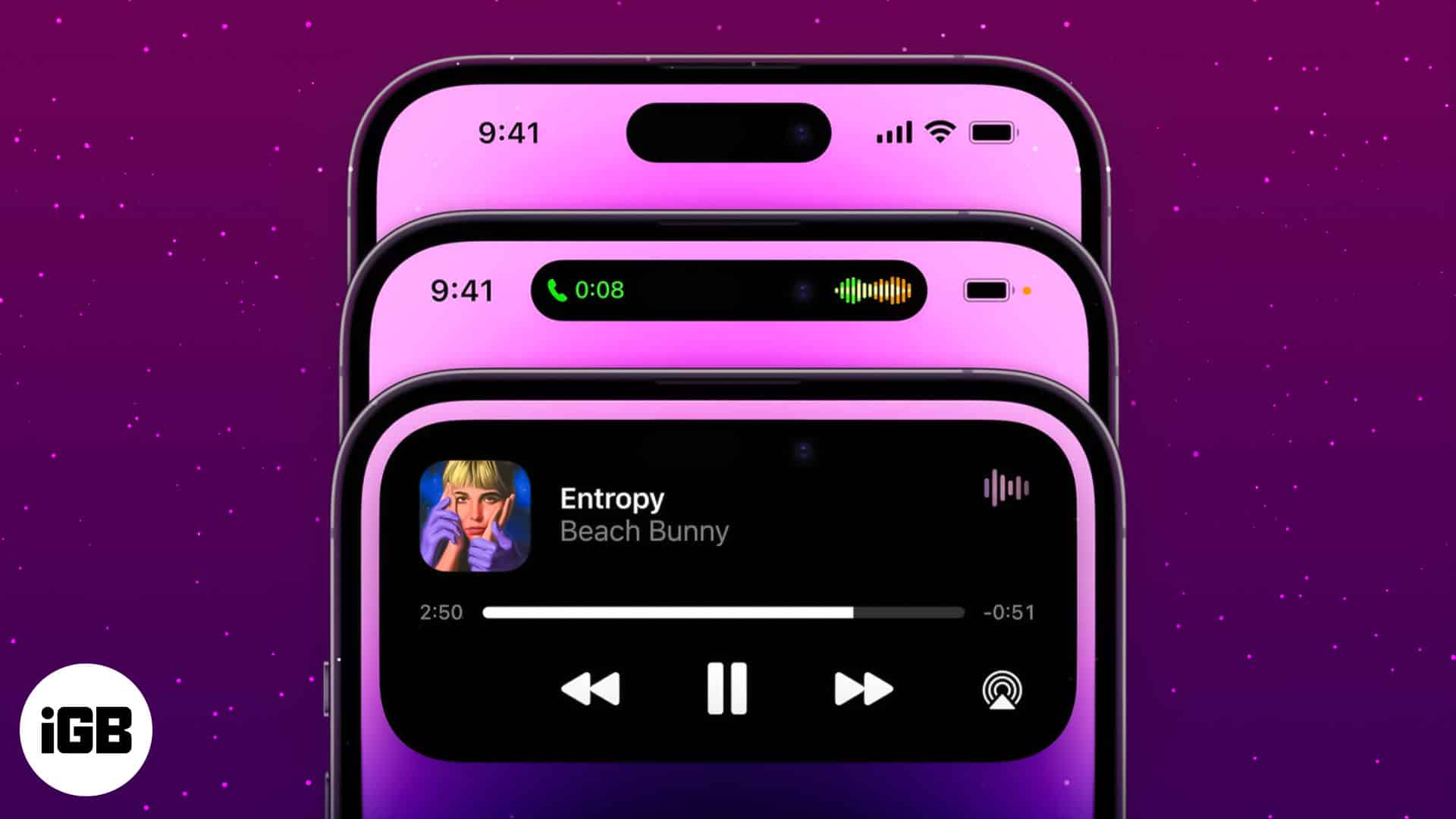
It uses transitions and uniquely crafted animations to create an illusion that the pill-shaped cutout fluidly morphs and transforms into different shapes, depending on the alert or activity.
It displays up to two background activities in separate bubble elements.
Shows alerts and notifications

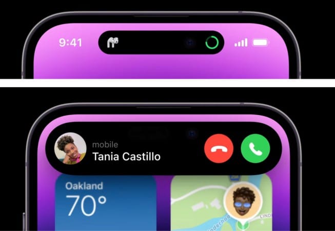
Dynamic Island shows you relevant alerts and notifications. For example, it allows you to stay updated about the Lyft you have booked. It also allows you to perform different actions by presenting relevant controls that work across the system.
What’s praiseworthy is that all of this works without interrupting you from whatever you’re doing in the app.
Another cool thing about this feature is how every alert has its own character and personality, making it easy for you to distinguish one from the other.
Become an iGeeksBlog Premium member and access our content ad-free with additional perks.
Examples of notifications and alerts that it displays include:
- Incoming and current calls
- Sound alert status
- Charge status
- Accessory connection
- Face ID identification
- Contactless transactions
Displays background activity
Dynamic Island not only supports alerts and notifications, though. It also displays your iPhone’s ongoing background activity, like the song you’re currently listening to on Apple Music.
So whenever you leave the app and swipe to go Home, apps morph into Dynamic Island to show the app’s activity in the background.
Gives access to controls

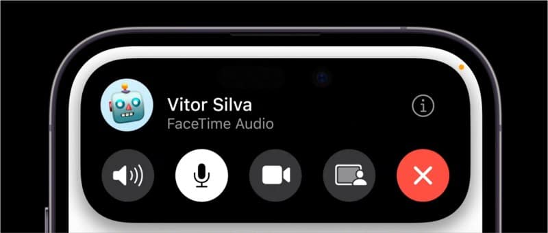
The feature also intuitively gives you easy control access, letting you perform relevant actions without leaving the app you’re using. For example, when you’re on a call, it enables you to adjust the volume, turn on the loudspeaker, end the call, and more.
All you need to do is to tap and hold Dynamic Island to expand and show more options or tap it to head back to the app.
Keeps you updated in real-time

The Dynamic Island is always active, adapting in real time, and updates you with crucial information, such as the next direction in Maps or the remaining time in Timer. What’s even more astounding is how it works seamlessly with Live Activities, a new iOS 16 Lock screen feature.
Live Activities keeps you on top of things occurring in real-time, like the food delivery order that’s bound to arrive in a few minutes, the ride you’ve booked with a friend, or the score of the basketball game you’re watching from another app.
But this feature isn’t limited to built-in Apple apps. Apple has created a robust design system for developers, ensuring all notifications and alerts are uniform and consistent, regardless of which app they come from.
Make sure you get the most out of your iPhone 15’s display with these great Dynamic Island wallpapers for iPhone 15 and 14 Pro that we’ve rounded up for you.
Wrapping up…
Apple has received much backlash in the past with its decision to put a notch on the iPhone. Now, it not only redesigns the hardware into a pill-shaped cutout, but it also levels up the game further by merging software magic to provide a more engaging and sensitive interface to its users.
What do you think about this new feature? Do you like it? Share your insights below!
Read more:
